
In 2024, making sense of your survey data doesn’t have to be a headache.
Customer surveys are crucial for obtaining insights about customers' preferences and experiences with your products, services, and brand as a whole.
With the right approach and tools, you can uncover valuable insights that drive meaningful action.
This guide walks you through the process of analyzing survey data, from organizing responses to visualizing trends and drawing actionable conclusions.
Whether you’re a seasoned researcher or new to the world of surveys, you’ll find practical tips and techniques to help you make the most of your data.
Let’s dive in and explore how to transform raw survey responses into powerful insights that shape your strategies and decisions.
1) Organizing Survey Responses for Effective Analysis
Analyzing survey data can be a daunting task, especially when dealing with a large number of responses. By considering the input of survey respondents and organizing your survey responses effectively, you can streamline the analysis process and uncover the most valuable insights.
In this section, we’ll guide you through the essential steps to prepare your survey data for analysis.
Remove incomplete or irrelevant responses
Start by eliminating any responses that are incomplete or do not provide meaningful information. For example, if a respondent has only answered a few questions or provided nonsensical answers, you'll want to remove their response from the dataset. This will help ensure that your analysis is based on high-quality data.
Standardize data formats
Next, take a close look at the data formats used in your survey responses. Ensure that dates, numbers, and other data types are consistently formatted across all responses.
For instance, if some respondents have entered dates in the format "MM/DD/YYYY" while others have used "DD/MM/YYYY," you'll need to standardize these formats to avoid confusion during analysis.

Assign unique identifiers to each response
To make it easier to track and reference individual responses during analysis, assign a unique identifier to each response. This could be a simple numeric ID or a combination of the respondent's initials and a timestamp. Having unique identifiers will help you quickly locate specific responses and cross-reference data points as needed.
Categorizing Open-Ended Responses
Survey questions are crucial in deriving meaningful insights, and carefully structuring them can significantly impact the quality of the data collected. Open-ended questions can provide rich, qualitative data, but they can also be challenging to analyze. To make sense of open-ended responses, you’ll need to categorize them into themes or categories ahead of time.
Group similar responses into themes or categories
Read through the open-ended responses and identify common themes or topics that emerge. For example, if you asked respondents about their favourite features of your product, you might notice that many people mention ease of use, specific functionalities, or customer support. Group these responses together under appropriate categories.
Create a codebook to ensure consistency in categorization
As you categorize responses, create a codebook that defines each category and provides examples of responses that fit into each one. This will help ensure that you're categorizing responses consistently throughout the analysis process, especially if multiple people are involved in the analysis.
Use text analysis tools for large datasets
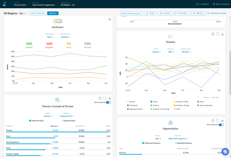
If you're dealing with a large number of open-ended responses, consider using text analysis tools to help with the categorization process. Kapiche is a text analytics tool that helps Insights leaders analyze survey data fast. Import all your survey data into Kapiche, and it will automatically group your feedback by theme, and identify common words, phrases, and trends in the data.

Creating a Data Matrix for Analysis
Once you've cleaned your data and categorized open-ended responses, it's time to create a data matrix that will serve as the foundation for your analysis.
Assign numerical values to categorical data
To make it easier to analyze categorical data (e.g., gender, age groups, or satisfaction levels), assign numerical values to each category. For example, you might assign "1" to "Male," "2" to "Female," and "3" to "Non-binary" when dealing with gender data.
Ensure each variable has its own column
In your data matrix, make sure that each variable (e.g., age, gender, satisfaction level) has its own column. This will make it easier to analyze the data and identify relationships between variables.
Use a spreadsheet or statistical software for organization
Depending on the size and complexity of your dataset, you can use a spreadsheet (e.g., Microsoft Excel or Google Sheets) to continue analysis, or a text analytics software like Kapiche to further process your data. Text analytics tools make it easier to manipulate and analyze your data, as well as create visualizations to help communicate your findings.

2) Identifying Patterns and Trends in Your Survey Results
Uncover hidden insights by analyzing frequencies, percentages, and central tendencies to identify trends in customer behavior
Identify key segments and subgroups through cross-tabulations and chi-square tests
Determine the strength and direction of relationships between variables using regression analysis
Calculating Descriptive Statistics
To begin analyzing your survey data, start by calculating descriptive statistics from your quantitative data. This involves determining frequencies, percentages, and central tendencies for each question or variable in your survey:
Frequencies show how many respondents selected each answer choice
Percentages indicate the proportion of respondents who chose each option
Central tendencies, such as the mean, median, and mode, provide a summary of the typical or average response.
To do this statistical analysis, use pivot tables in spreadsheet software like Microsoft Excel, or leverage a tool like Kapiche to do this automatically for you. This will help you quickly identify the most common responses and any outliers or unusual data points.
Conducting Cross-Tabulations
Cross-tabulations allow you to examine relationships between two or more variables in your survey data. For example, you might want to see if there are differences in satisfaction levels based on age group or gender.
To conduct a cross-tabulation, create a contingency table that displays the frequencies or percentages for each combination of variables. You can then use a chi-square test to determine if there is a statistically significant relationship between the variables.
Performing Regression Analysis
Regression analysis is a powerful tool for determining the strength and direction of relationships between variables in your survey data. It allows you to identify which factors are most strongly associated with key outcomes, such as customer satisfaction or purchase intent.
To perform a regression analysis, you'll need to select a dependent variable (the outcome you want to predict) and one or more independent variables (the factors you believe may influence the outcome). You can then use statistical analysis software, such as SPSS, SAS, or R, to a feedback tool like Kapiche to run the analysis for you.
Interpreting Regression Results
When interpreting regression results, focus on the following key statistics:
R-squared: This value indicates the proportion of variance in the dependent variable that is explained by the independent variables. Higher values indicate a stronger relationship.
Coefficients: These values show the direction and magnitude of the relationship between each independent variable and the dependent variable. Positive coefficients indicate a positive relationship, while negative coefficients indicate an inverse relationship.
P-values: These values indicate the statistical significance of each independent variable. A p-value less than 0.05 is generally considered significant, meaning that the relationship is unlikely to have occurred by chance.
By conducting regression analyses, you can identify the most important predictors of key outcomes in your survey data and make data-driven decisions to improve your products, services, or marketing strategies.
3) Visualizing Survey Data for Clarity and Insight
Transform raw data into visually appealing charts and graphs
Choose the right chart type based on the data and insights you want to convey
Use data visualization best practices to create effective and easy-to-understand visuals
Analyzing survey data is just the first step in gaining valuable insights. To effectively communicate your findings and make them more accessible to stakeholders, it's essential to visualize your survey data using charts, graphs, and other visual representations.
Choosing the Right Chart Types
Different chart types are suited for different types of data and the message you want to convey. Here are some common chart types, and when to use them:
Use bar charts for categorical comparisons
Bar charts are ideal for comparing categorical data, such as the number of respondents who selected each answer option in a multiple-choice question. They allow you to quickly identify the most popular or least popular choices, as well as any significant differences between categories.
Line graphs for trends over time
If your survey includes questions that track changes over time, such as customer satisfaction ratings or engagement levels, line graphs are the perfect choice. They help you visualize trends, patterns, and any notable increases or decreases in the data.
Pie charts for proportions of a whole
Pie charts are best used when you want to show the composition of a whole, such as the percentage of respondents who belong to different age groups or the proportion of customers who would recommend your product or service. However, be cautious when using pie charts, as they can be difficult to interpret when there are many categories or when the proportions are similar.

Designing Effective Data Visualizations
Creating visually appealing charts is not enough – you also need to make sure that your visualizations actually convey the right message. Here are some best practices to follow:
Keep charts simple and uncluttered
Avoid overwhelming your audience with too much information in a single chart. Keep your visuals clean and focused on the most important data points. Remove any unnecessary elements, such as grid lines or data labels, that don't add value to the overall message.
Use colors strategically to highlight key findings
Color is a powerful tool in data visualization. Use distinct colors to differentiate between categories or to highlight key findings. However, be mindful of color accessibility and ensure that your color choices are distinguishable by those with color vision deficiencies.

Ensure charts are properly labeled and easy to interpret
Always include clear and concise titles, labels, and legends in your charts. This helps your audience quickly understand what the data represents and how to interpret the visual. If necessary, provide brief explanations or annotations to clarify any complex or ambiguous data points.
Leveraging Data Visualization Tools
While you can create basic charts using spreadsheet programs like Microsoft Excel or Google Sheets, consider using a tool designed to elevate the presentation of your insights.
For more advanced customization, and to make sure your insights actually resonate with your audience, here are a few options to consider:
Use spreadsheet programs for basic charts
If your visualization needs are simple, spreadsheet programs can be a quick and easy way to create charts. Most spreadsheet software comes with built-in chart templates that you can easily customize with your survey data.
Explore specialized tools like Kapiche for interactive dashboards
For more advanced data visualization needs, consider using a specialized survey data analysis tool like Kapiche. The platform allows you to create interactive dashboards that enable users to explore and drill down into the data. It also offers a wide range of chart types and customization options to help you create visually stunning and informative dashboards.
Consider infographics for sharing results with a wider audience
Infographics are a great way to present survey findings to a broader audience, like on social media or in blog posts. By combining charts, illustrations, and concise text, infographics can help you tell a compelling story with your survey data. There are many free and paid tools available for creating infographics like Canva, Piktochart, and Venngage.
Follow these guidelines, and with the right tools, you can transform your survey data into powerful visuals that drive understanding and decision-making.
Remember, the goal is to make your survey insights as accessible and actionable as possible for your audience. Effective data visualization is a critical step in making that happen.
4) Drawing Actionable Insights from Survey Analysis
Identifying Key Takeaways
To draw actionable insights from your survey data, start by focusing on the most significant research findings that directly address your research questions. Summarize notable results and correlate information to ensure a comprehensive understanding. These key takeaways should include both expected and surprising results, as they will form the basis for your recommendations.
When identifying key takeaways, consider the following:
Patterns and Trends
Look for patterns and trends in your data that stand out. For example, if you notice a consistent increase or decrease in a particular metric over time, this could indicate an important trend worth exploring further.

Differences Between Groups
Analyze differences between various subgroups within your survey population. This could include demographic segments, user types, or any other relevant categorizations. Identifying significant differences between groups can help you tailor your insights and recommendations to specific audiences.
Open-Ended Responses
Don't overlook the value of open-ended responses in your survey data. These qualitative insights can provide rich context and help explain the "why" behind your quantitative findings. Use text analysis techniques to identify common themes and sentiments expressed by respondents.
Developing Recommendations
Once you've identified your key takeaways, the next step is to translate these insights into specific actions or strategies. Your recommendations should be tailored to your target audience and prioritized based on feasibility. Remember, if the insight can't be implemented, it's not actionable.
Consider the following when developing recommendations:
Addressing Pain Points
Use your survey insights to identify pain points or areas for improvement within your organization or product. Develop recommendations that directly address these issues and provide clear steps for resolution.
Leveraging Strengths
In addition to addressing weaknesses, look for opportunities to leverage your strengths based on positive feedback from your survey. Consider how you can further capitalize on these strengths to drive growth and success.
Setting Measurable Goals
Ensure your recommendations are tied to specific, measurable goals. This will help you track progress and demonstrate the impact of your survey insights over time.
5) Communicating Results Effectively
The final step in drawing actionable insights from your survey data is effectively communicating your findings and recommendations to key stakeholders. This involves creating clear, engaging reports and presentations that highlight the most important information.
To communicate results effectively:
Create Executive Summaries
Develop concise executive summaries, or a survey report, that distills your key findings and recommendations into easily digestible formats. These summaries should be tailored to the needs and interests of your specific stakeholder groups.
Use Storytelling Techniques
Engage your audience by using storytelling techniques to present your survey insights. Use real-world examples, case studies, and anecdotes to illustrate your points and make your findings more relatable and memorable.
Present Results in Multiple Formats
Recognize that different stakeholders may prefer to consume information in different ways. Present your survey results in multiple formats, such as written reports, visual presentations, infographics, or interactive dashboards, to cater to various preferences and learning styles.
Analyzing Survey Data Made Simple
Analyzing survey results involves various methods, calculations, and best practices for interpreting and drawing insights from the data.
Cleaning, categorizing, and analyzing survey data doesn’t have to be a daunting task. By following the step-by-step guide outlined above, you can efficiently organize your data, identify meaningful patterns, and create impactful visualizations that drive decision-making.
Remember, the key to successful survey analysis lies in asking the right questions, ensuring data quality, and leveraging the tools at your disposal, such as Excel or specialized software.
Ready to put your survey data to work?
Start by reviewing your survey responses and identifying the most pressing insights. Then, based on your findings, craft a clear action plan and communicate your recommendations to key stakeholders.
What's one key insight you've uncovered from your survey data that you're excited to act on?
Check out how Kapiche can help you quickly analyze survey data, by watching an on-demand demo here today.


